This post explains how to create Photoshop-style 3D text effects using CSS3 text-shadow and @font-face property. These properties are supported in all modern browsers like Chrome, Safari, and Firefox, except Internet Explorer, is dead. Try following examples and enrich your web pages, use better color combinations for pretty results
Effect 1
.effect_1
{
color: #fff;
font: 80px Times New Roman, Times, serif;
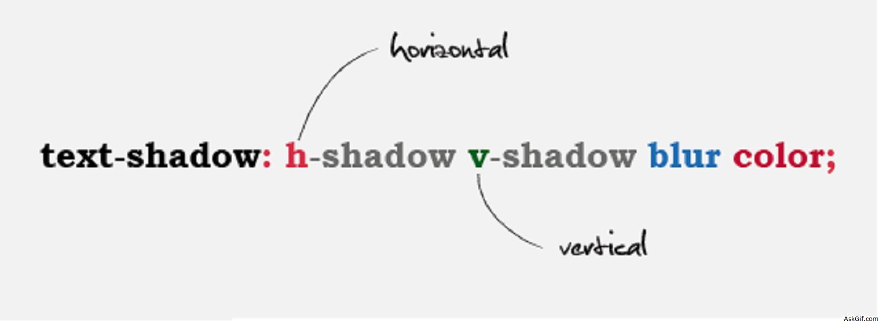
text-shadow: 0 1px 0 #999,
0 2px 0 #999,
0 3px 0 #999,
0 4px 0 #999,
0 5px 0 #999,
0 6px 0 #000;
}Effect 2
.effect_2
{
font: 80px Times New Roman, Times, serif;
text-shadow: -1px -1px 0px #000, 1px 1px 0px #666;
}
Effect 3
.effect_3
{
font: 80px Times New Roman, Times, serif;
text-shadow: 2px 2px 8px #fff;
color: transparent;
}
@font-face
@font-face
{
font-family: chandy;
src: url('comesinhandy.ttf') format("opentype");
}
.myfont
{
font-family:chandy;font-size:80px
}
// HTML Code
<div class="myfont">Sumit Chourasia</div>

