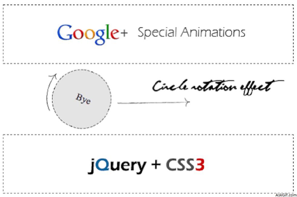
Google plus given an awesome kick to user experience, especially circles UI animations. I feel it’s a great and new definition to have user experience design. I have tried the circle rotation animation effect with Jquery and CSS3. Just few lines of code applying CSS styles using jQuery methods like .addClass() and .animation(). Take a look at these live demos with modern brewers.
Javascript Code
$(".square").click(function(){})- square is the class name of DIV tag. Using $(this).animation() and $(this).addClass() - applying animation and class styles.
<script type="text/javascript" src="http://ajax.googleapis.com/
ajax/libs/jquery/1.5/jquery.min.js"></script>
<script type="text/javascript" src="easing.min.js"></script>
<script type="text/javascript">
$(document).ready(function()
{
$(".square").click(function()
{
$(this).animate({width:'100px',height:'100px'}, 500, 'linear', function()
{
$(this).addClass('circle-label-rotate');
}).addClass('circle').html('<div class="innertext">Bye</div>').animate({"opacity":"0","margin-left":"510px"},1500);
$(this).slideUp({duration: 'slow',easing: 'easeOutBounce'}).hide();
});
});
</script>
//HTML Code blocks
<div class='square'> 1</div>
<div class='square'> 2</div>
<div class='square'> 3</div>
Circle
CSS3 circle diameter 50px
.circle
{
border-radius: 50px; // Chrome & IE9
-moz-border-radius: 50px; // Firefox
-webkit-border-radius: 50px; // Safari
height:100px;
width:100px;
background:#dedede;
}
Rotation
CSS3 rotating 0 - 360 degrees
@-webkit-keyframes rotateThis
{
from {-webkit-transform:scale(1) rotate(0deg);}
to {-webkit-transform:scale(1) rotate(360deg);}
}
.circle-label-rotate
{
-webkit-animation-name: rotateThis;
-webkit-animation-duration:2s;
-webkit-animation-iteration-count:infinite;
-webkit-animation-timing-function:linear;
}
Square
Contains CSS code.
.square
{
height:100px;
width:500px;
border:dashed 1px #000;
margin-top:10px;
}

